For my Senior Capstone Project, I combined my academic experience in graphic design and psychology to answer the following research question:
Given that many Tulane students may be unaware of cognitive distortions negatively affecting their mental health, how can we leverage graphic design for print media to effectively raise awareness of these distortions and provide strategies for overcoming them?

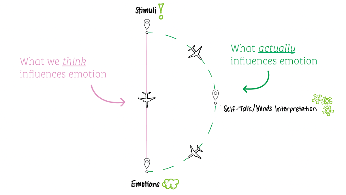

The concept of cognitive distortions was initially developed in 1976 by psychiatrist Aaron Beck, the father of Cognitive Behavioral Therapy (CBT). Beck found that his patients struggling with depression often had challenges that were rooted in negative, automatic thoughts. He found his patients’ challenges were often based in their inaccurate perceptions of situations, rather than the situations themselves, and defined cognitive distortions as maladaptive patterns of thinking that distort our perception of reality.
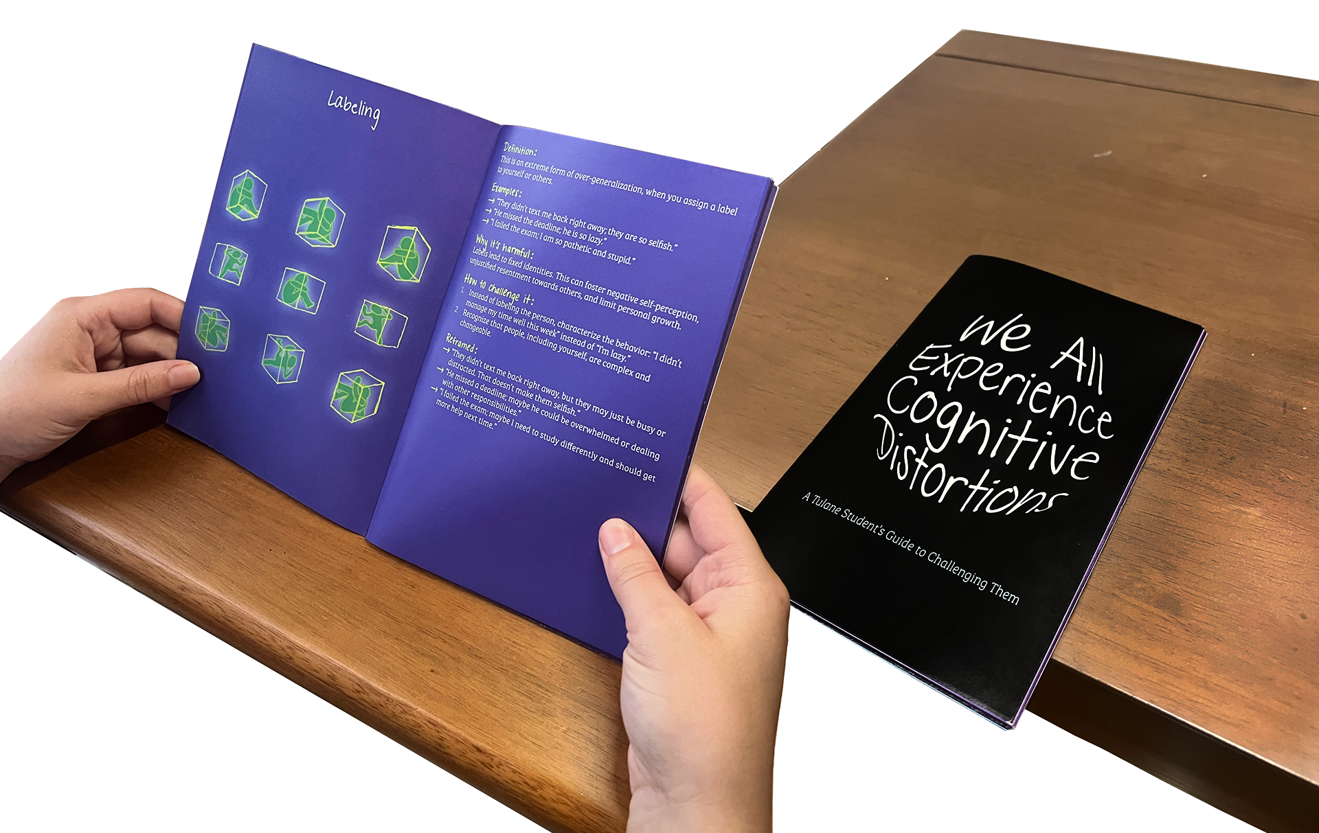
This pamphlet for Tulane students depicts cognitive distortions, shares how they affect mental health, and provides practical strategies to challenge and reframe them. This resource is designed to empower students to recognize distortions in their daily lives and take steps toward emotional resilience and well-being.
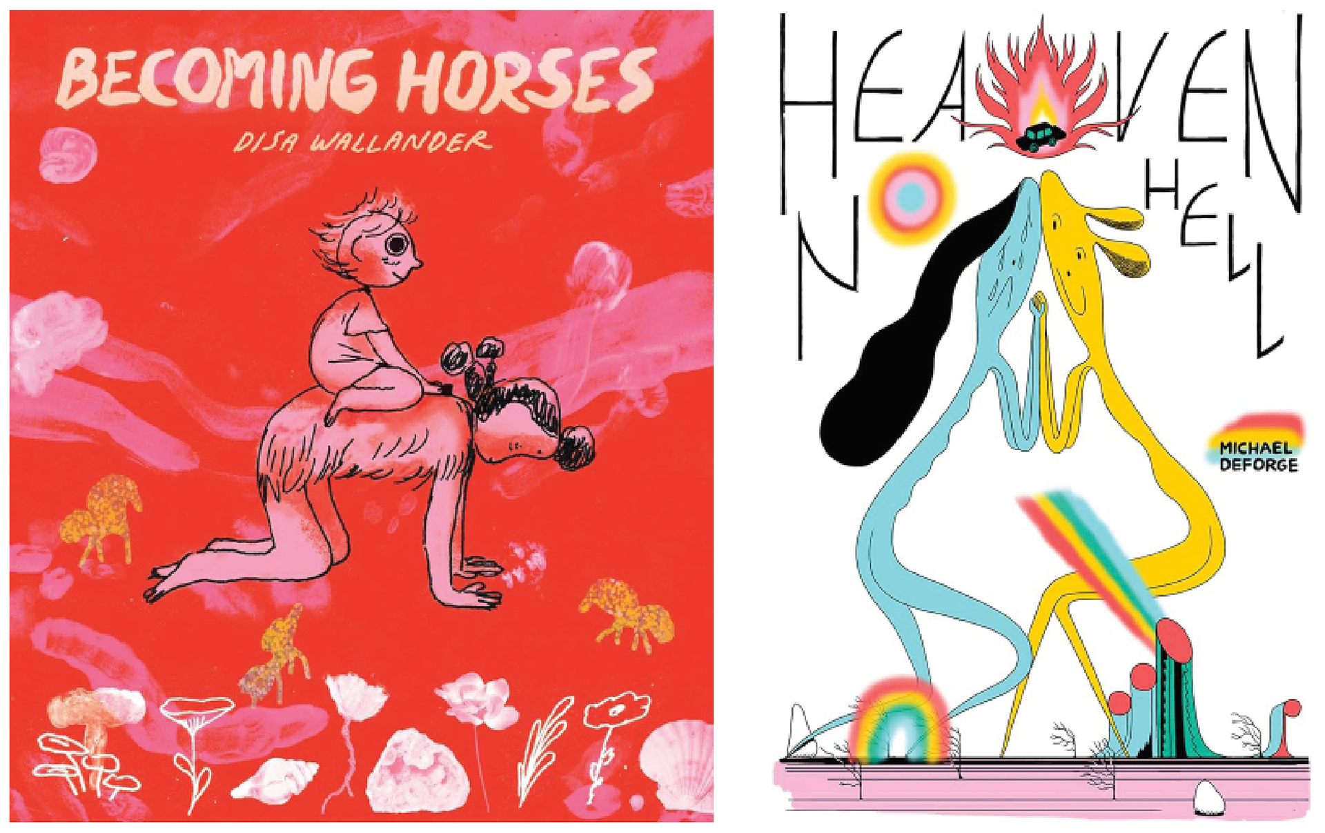
A comic book store served as a source of inspiration for discovering graphic design styles that effectively convey cognitive distortions, while maintaining a humanistic and inviting tone, tailored to resonate with college students. The design elements in Heaven No Hell by Michael DeForge and Becoming Horses by Disa Wallander were especially influential, showcasing techniques like sketchy outlines, doodles, gradients, envelope distortions, and handwritten typography.
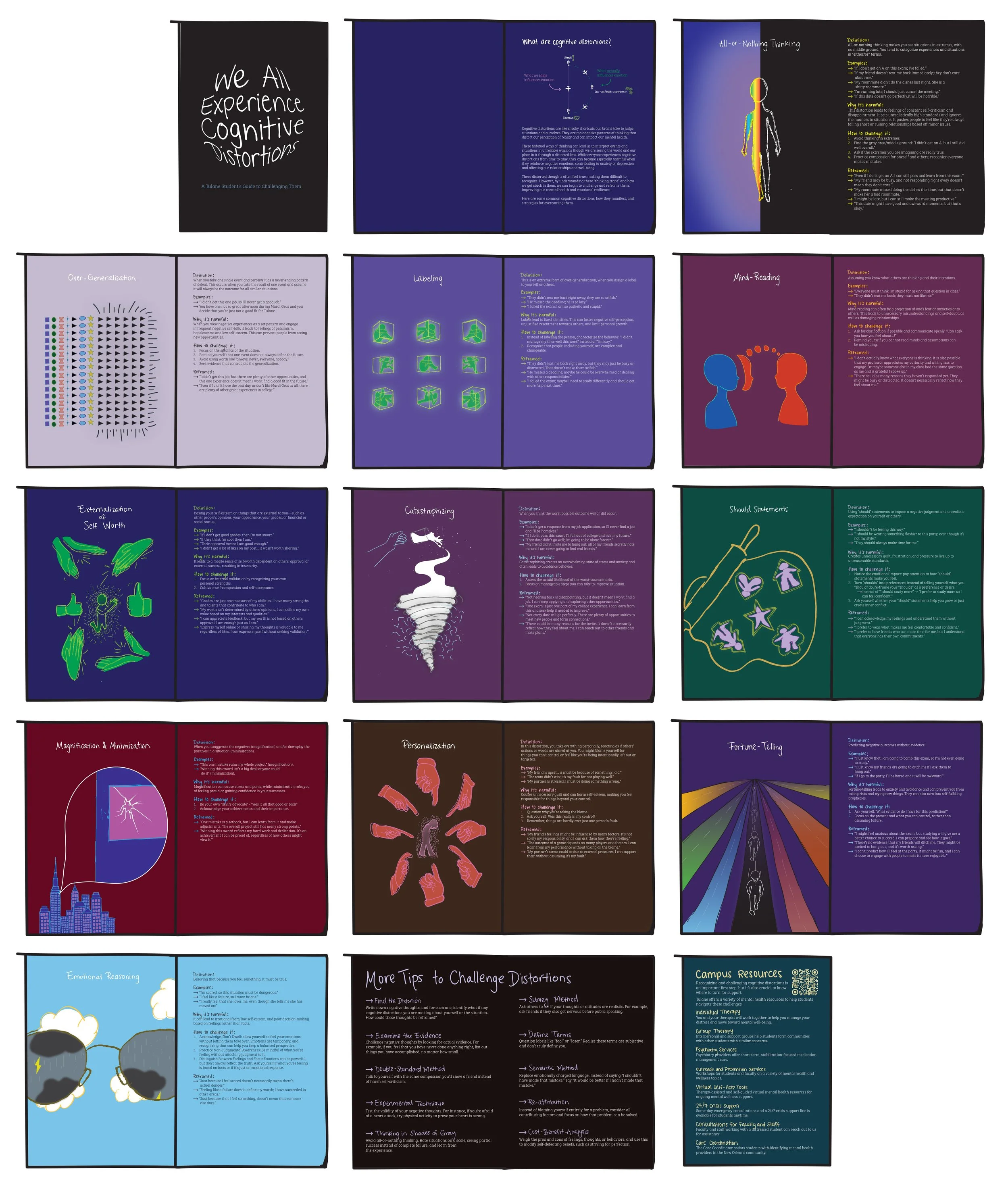
The pamphlet is structured to be engaging and easy to navigate. Each cognitive distortion is given its own dedicated page spread, featuring a visually striking graphic on the left page. The right page features a definition of the distortion and real-life examples of how the distortion manifests in thoughts and beliefs relevant to Tulane students. The right page also includes specific strategies to challenge the distortions and ways to reframe the thoughts and beliefs. Following covering individual cognitive distortions, there is a page spread that offers readers a list of practical tools that apply universally for challenging cognitive distortions. The pamphlet concludes with a campus resources page, which highlights mental health services available to students, ensuring they know where to turn for additional support. This comprehensive structure educates readers about cognitive distortions, provides actionable steps, and connects them to resources for further help.
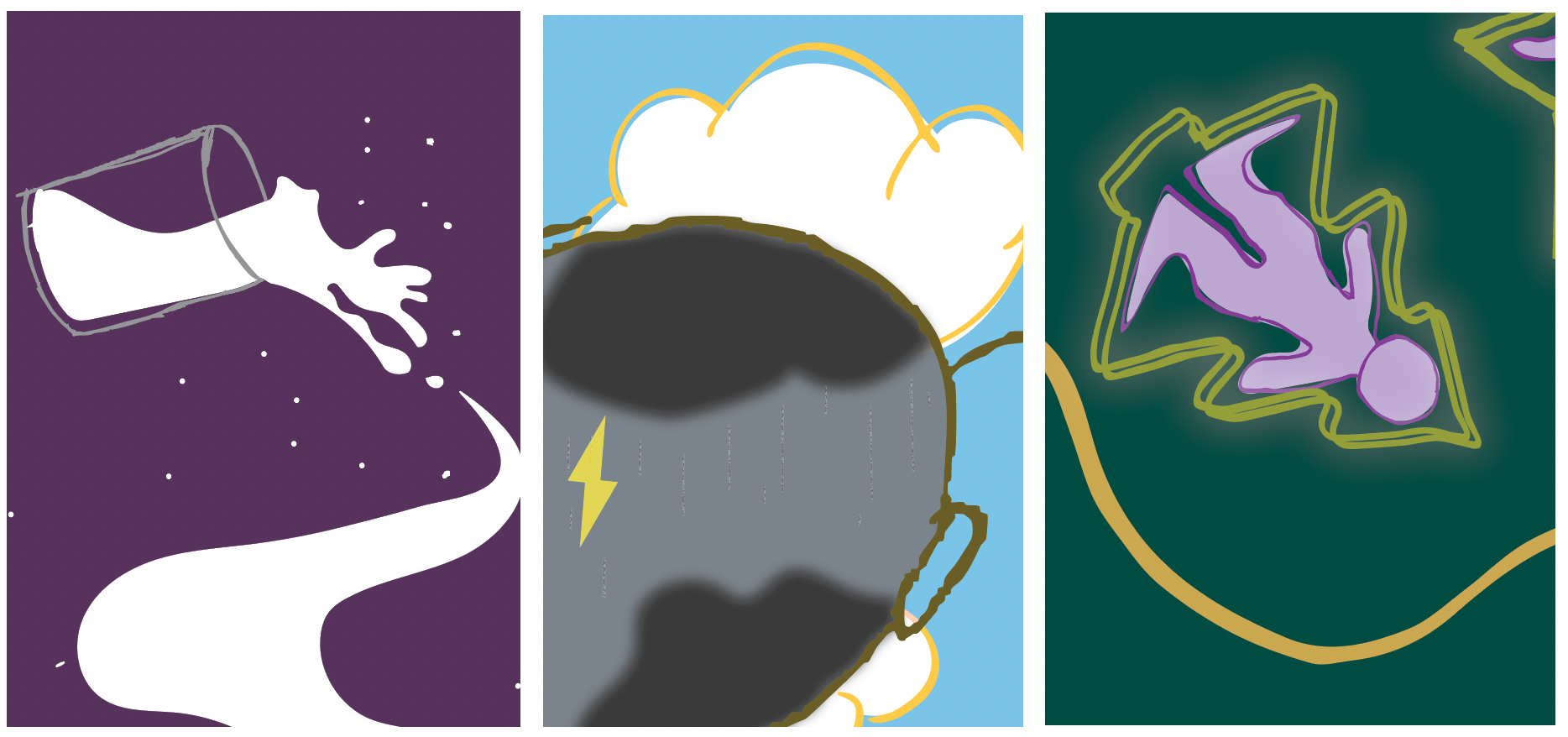
The icon-style graphics serve as visual anchors, making abstract concepts more clear, relatable and memorable. For example, the spilled milk turning into a tornado-like figure (above left) symbolizes reacting to minor events as though they are major catastrophes.

Envelope distortions mirror how cognitive distortions warp reality. By bending and stretching text or shapes, they mimic the way thoughts can be inaccurate or out of balance. This creates a sense of tension and reflects the emotional discomfort of distorted thinking, while also making the visuals more engaging.
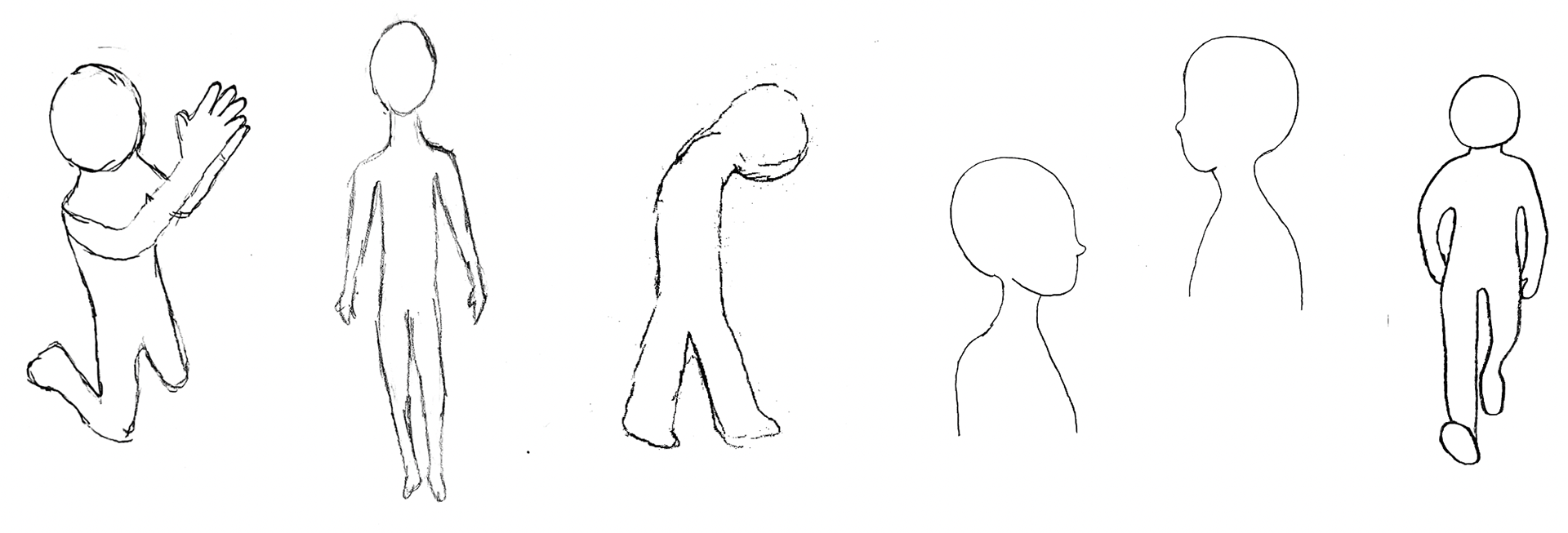
Minimal and predominantly abstract, in order to represent anyone and invite readers to project their own experiences onto them.
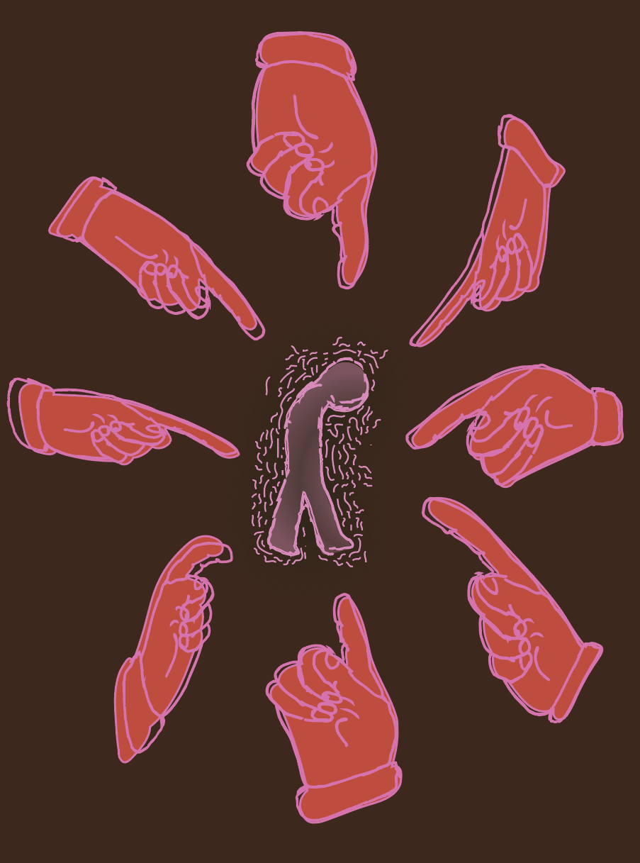
Body language often conveys struggle, confinement, or imbalance, reinforcing distortions’ emotional impact. Add a humanistic quality, creating an approachable and personal feel that is not overly clinical or detached.
Give a sense of vulnerability to the figures and graphics, reflecting the emotional complexity involved in confronting cognitive distortions.


Emphasize key elements while symbolizing how cognitive distortions amplify and distort negative thoughts.
Outer glows isolate and exaggerate specific visuals, mimicking how cognitive distortions make certain negative thoughts feel dominant and intrusive.
Gradients, with their smooth transitions, mirror how distortions blur reality and draw disproportionate attention to certain ideas or feelings.
The chaotic quality of doodles represents the mental “noise” these distortions create. Together, these design elements visually capture the overwhelming and exaggerated nature of distorted thinking.

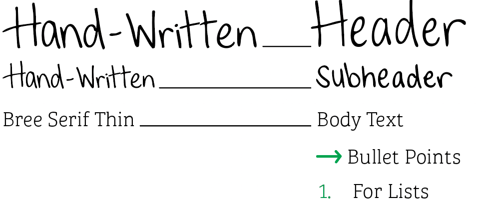
The use of handwritten font creates a personable and approachable tone, while the clean Bree Serif Thin font balances it with professionalism and readability.
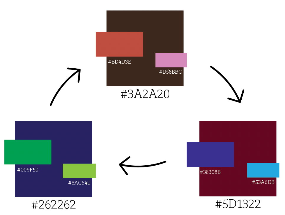
A custom contrasting color scheme is used in the pamphlet to create a dynamic and cohesive design. Each cognitive distortion follows the same color harmony, with adjusted hues to add variety and provide each distortion with a distinct identity.