Branding for Advocacy: Gun Violence Reduction Campaign
For my class, Visual Communications and Advocacy, I was tasked with creating an imagined brand and campaign for a cause of my choice. I chose to focus on reducing gun violence in America and designed what I coined the "Enough" campaign.
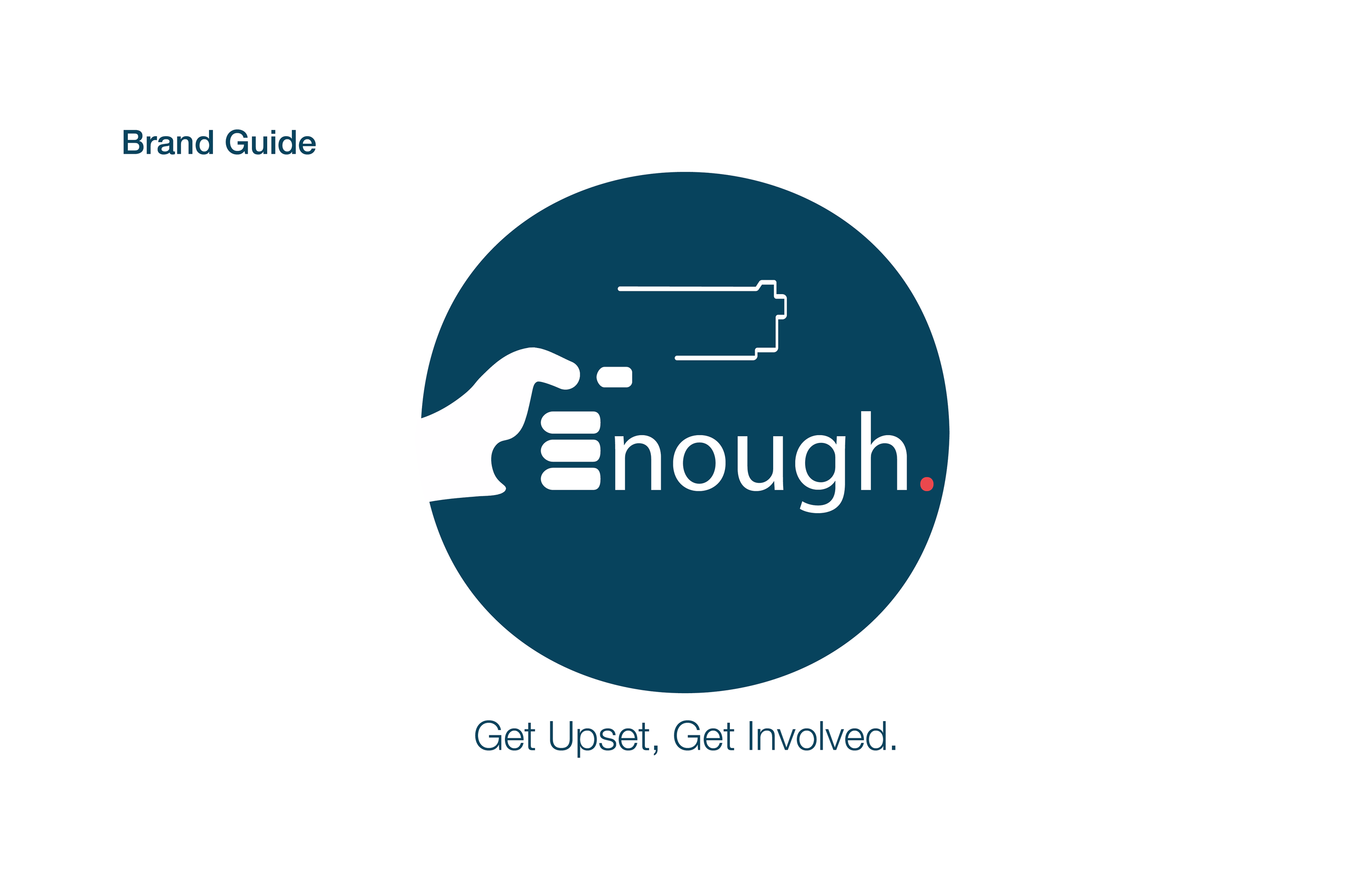
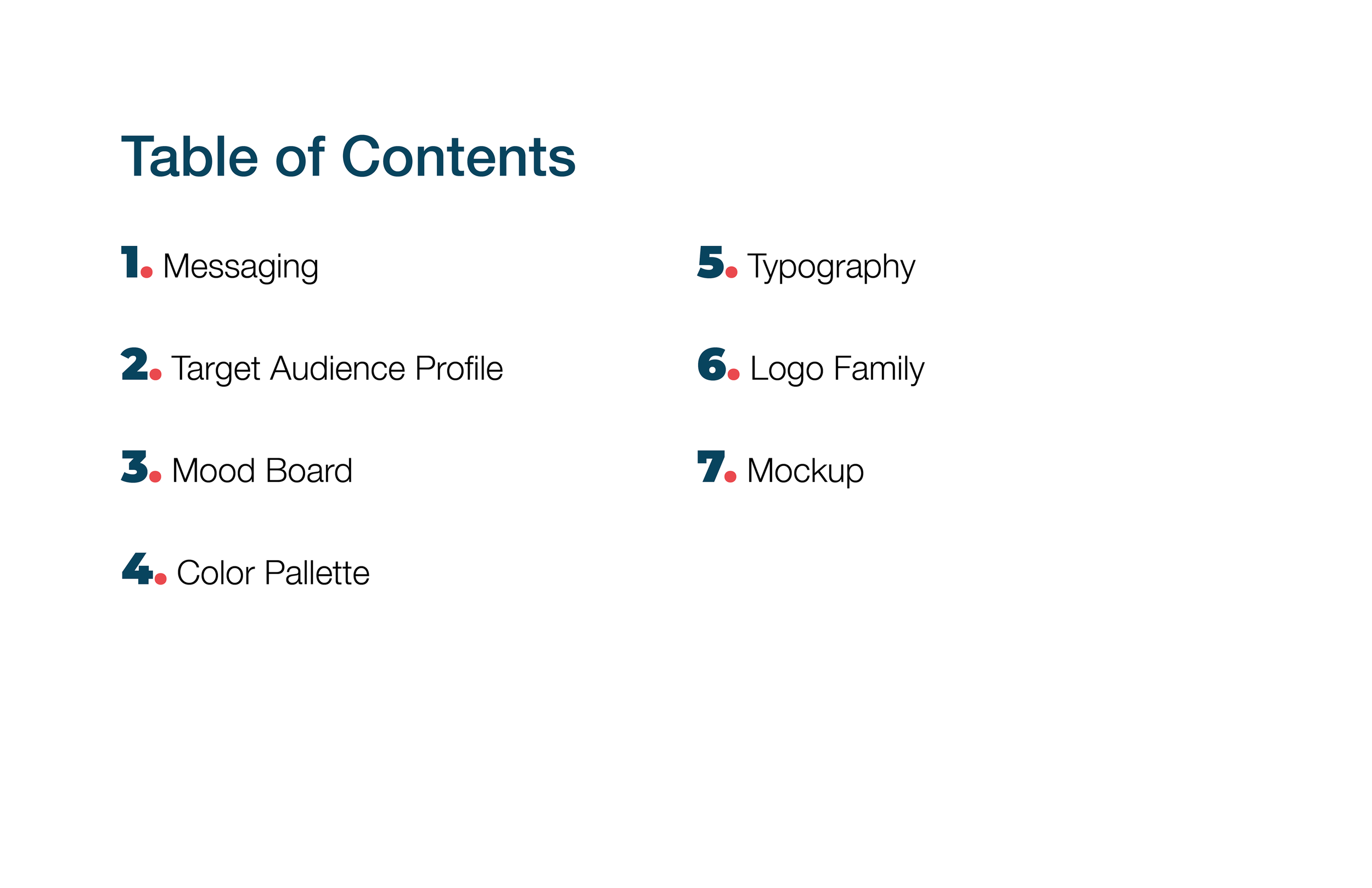
Brand Guide
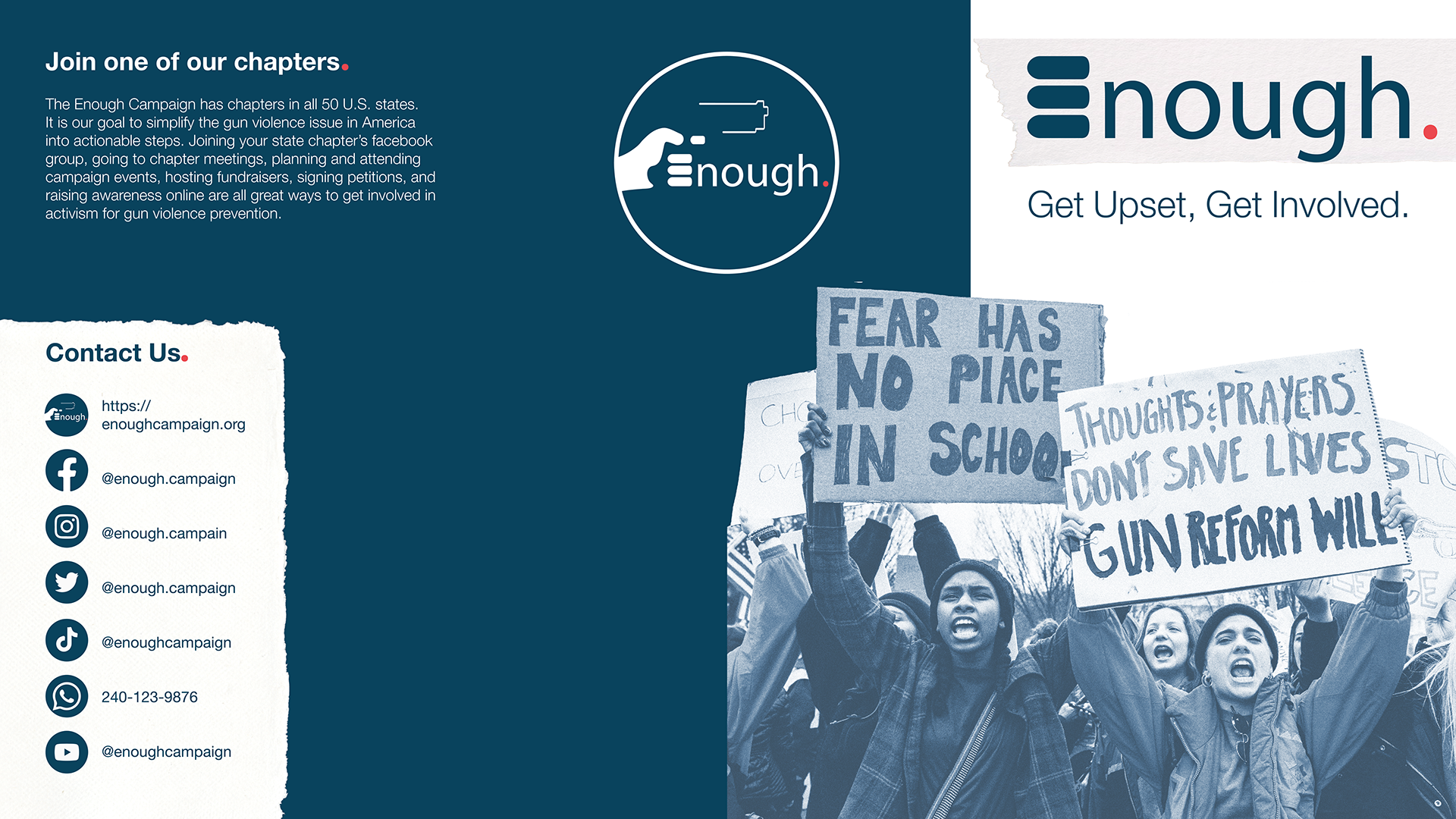
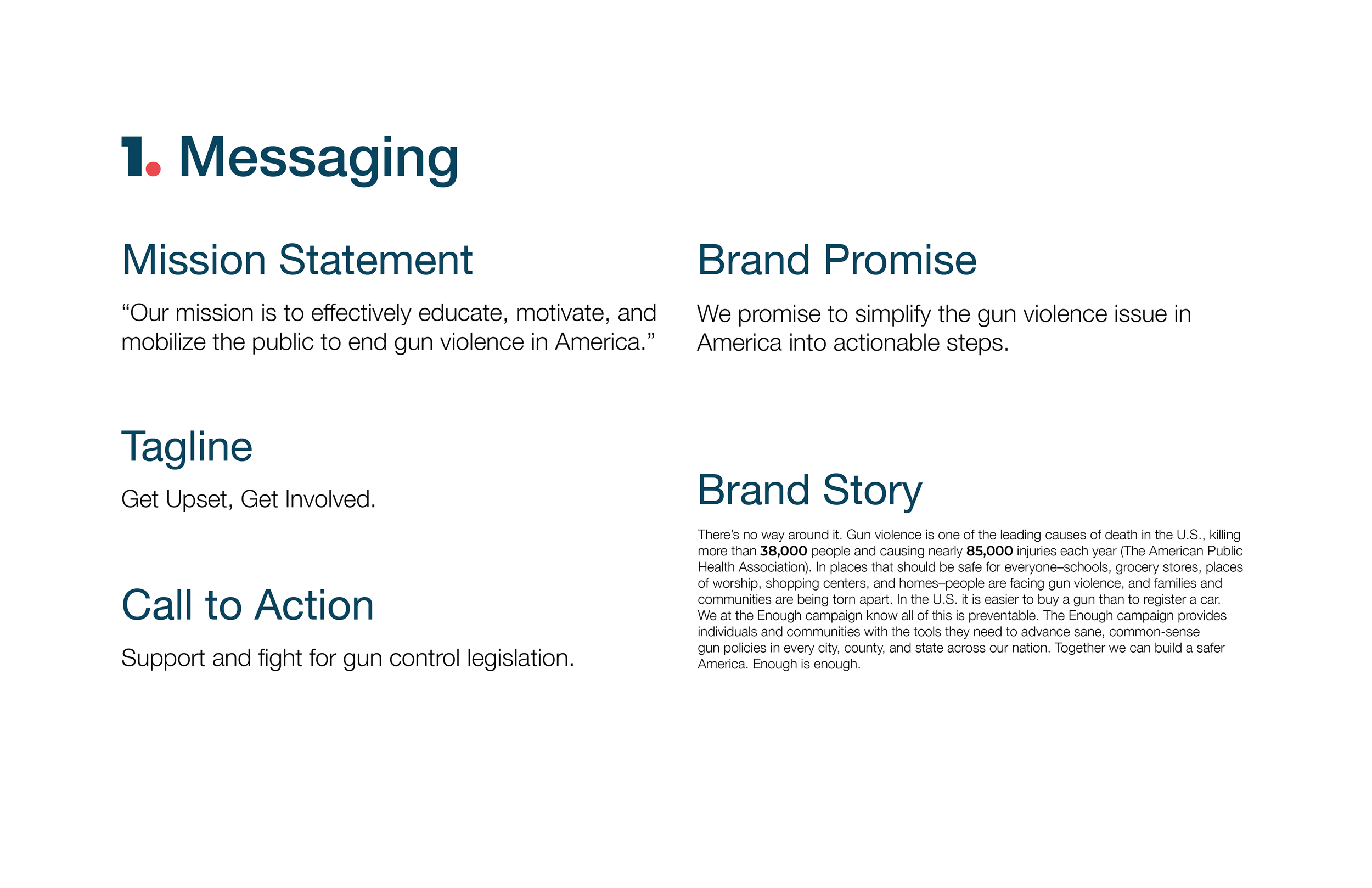
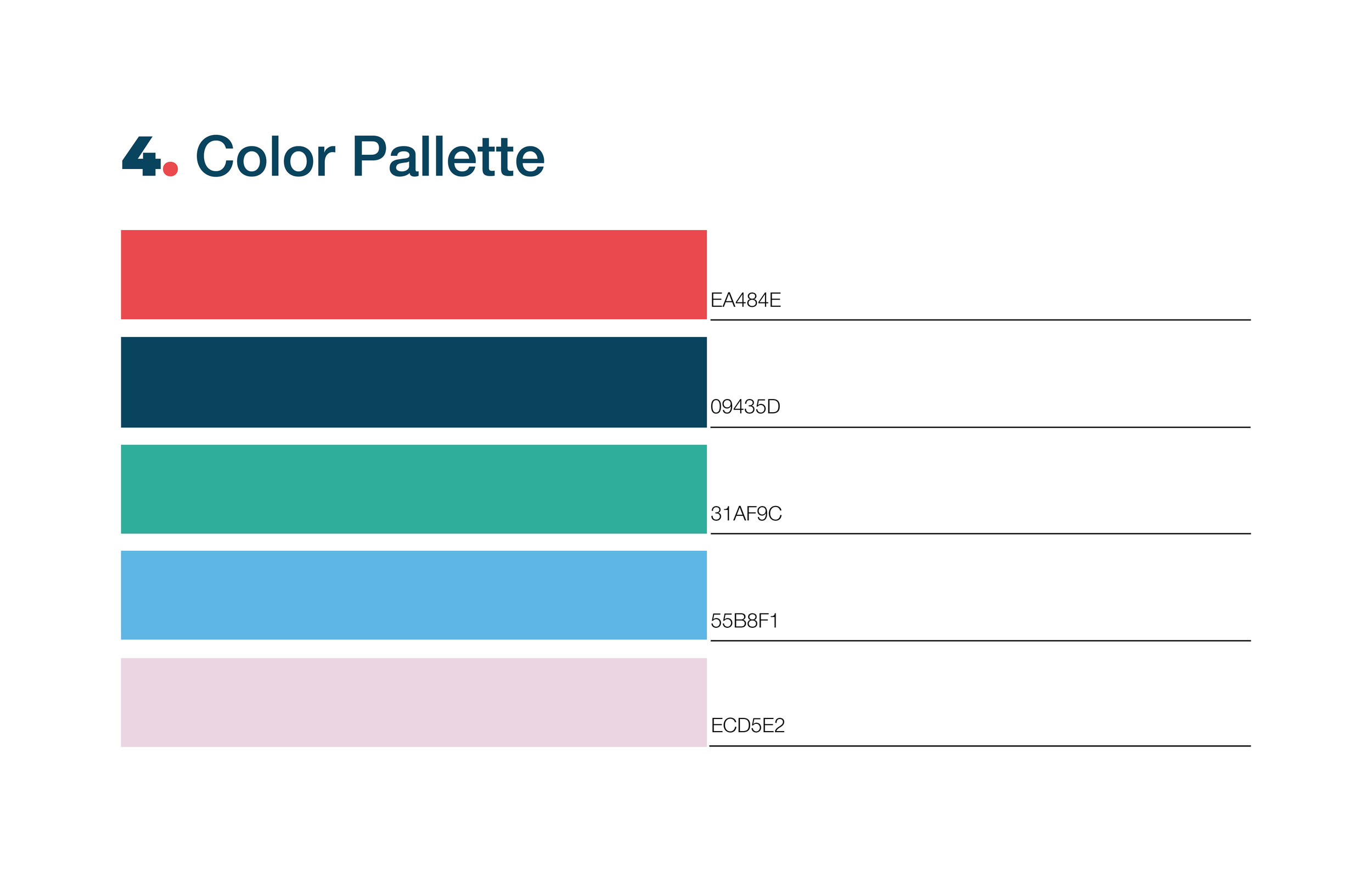
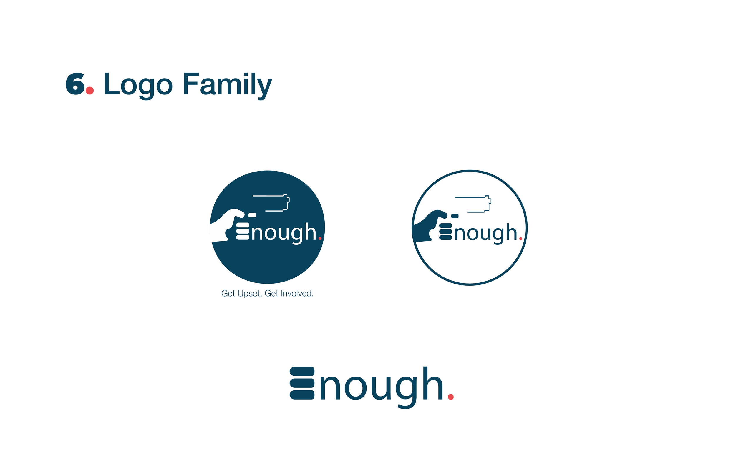
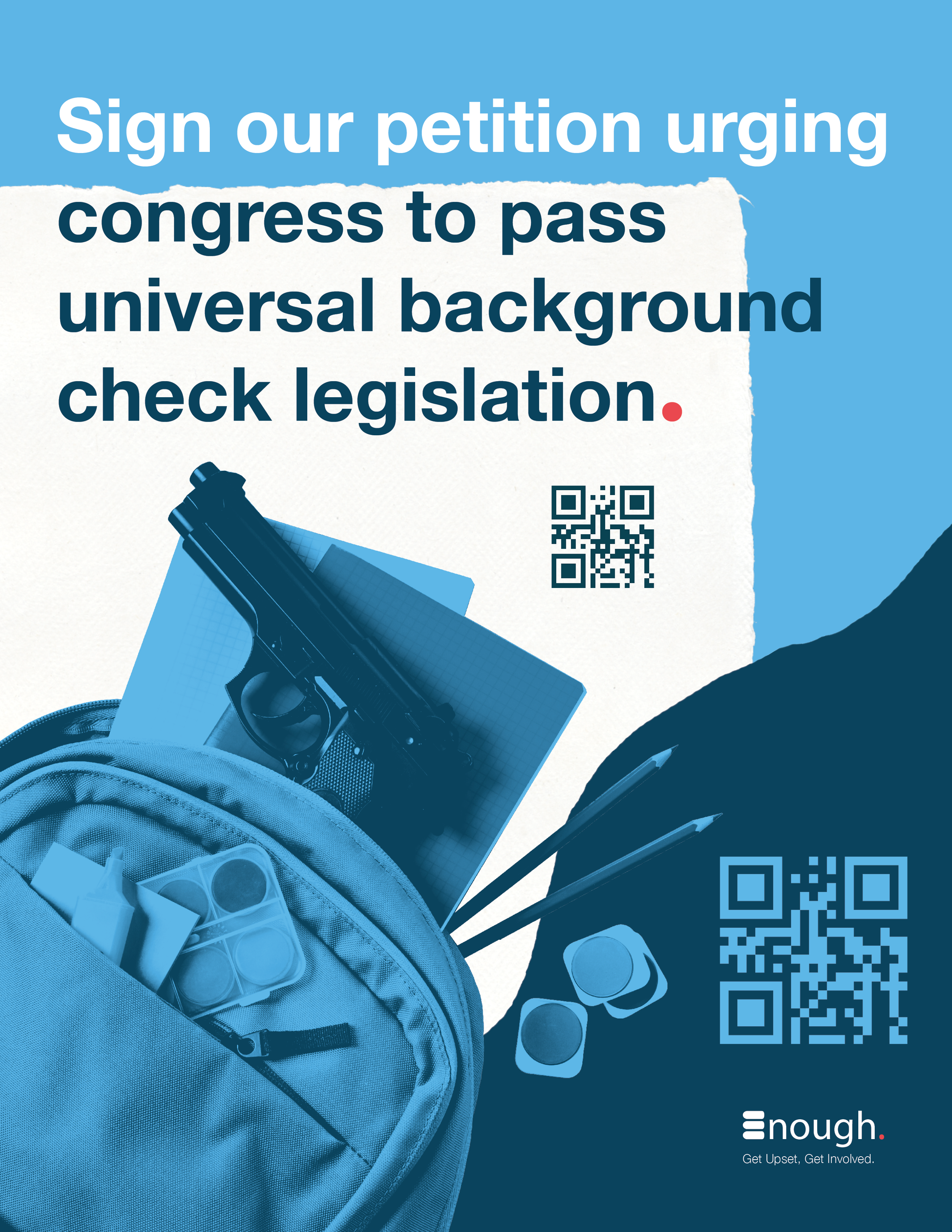
This brand guide defines the messaging and visual identity of the Enough campaign. The design draws inspiration from newspapers and layering, symbolizing the accumulation of this ongoing crisis of gun violence in the U.S. To reinforce the message, I used red and blue in slightly off-tone shades from traditional U.S. colors, representing a ‘tainted’ America and emphasizing that gun violence is a national issue. Additionally, I incorporated light blue, pink, green, and red to evoke both compassion and urgency. In the logo, I manipulated a figure-ground relationship between the colors blue and white to form the word “Enough” in th shape of a hand holding a gun, with the 'E' in the logo symbolizing both bullets and fingers. Gradients overlay images to maintain color palette consistency while reinforcing the figure-ground concept present in the logo.


Campaign
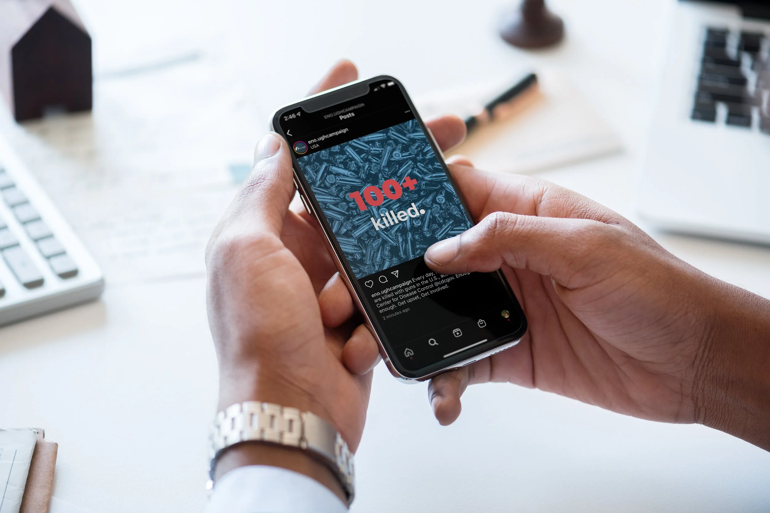
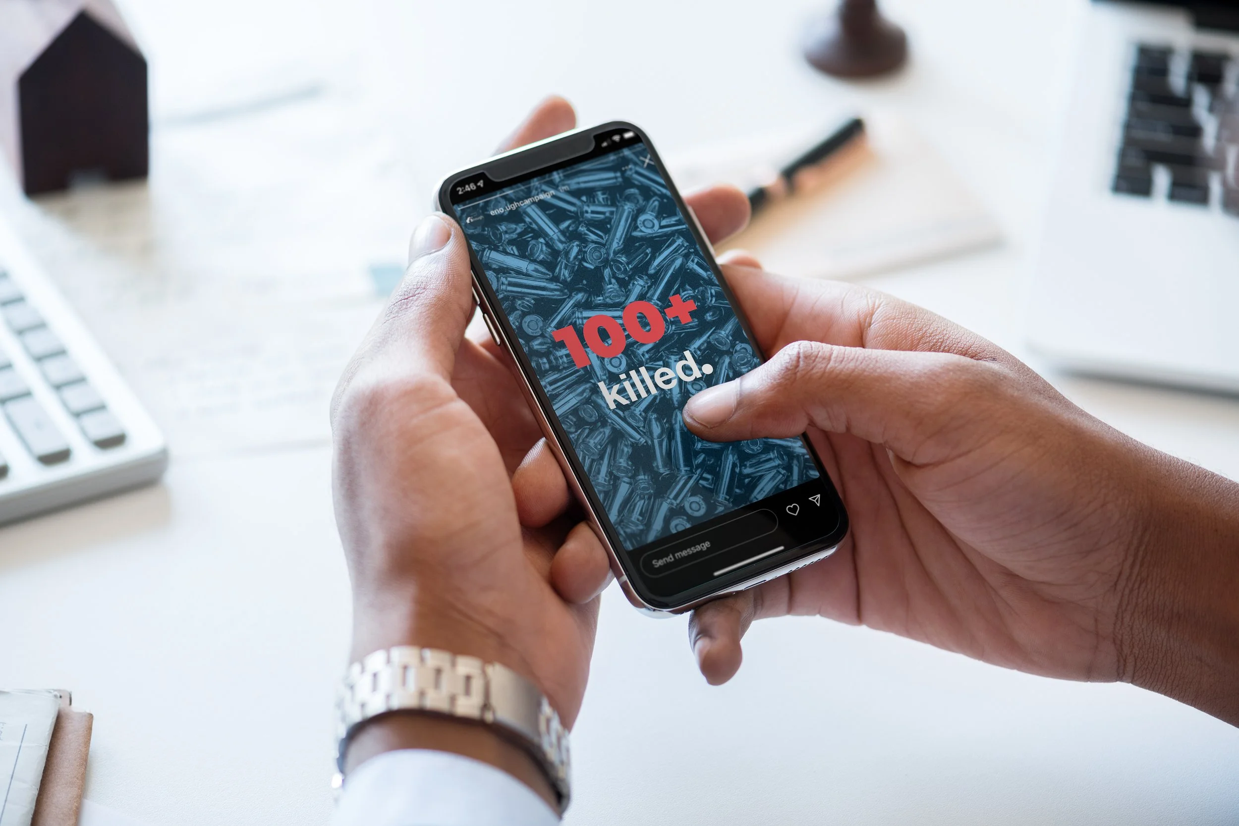
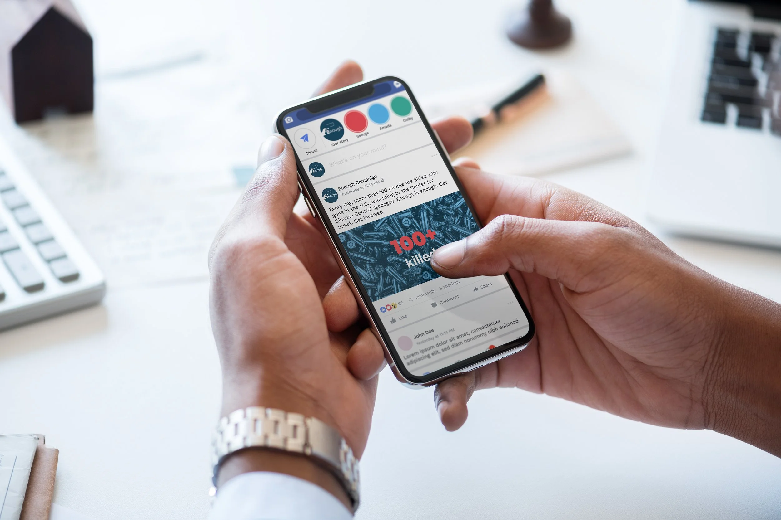
In application of the branding guidelines created for Enough, I stylistically designed and produded campaign assets, including a tri-fold brochure, a flier, and social media posts.
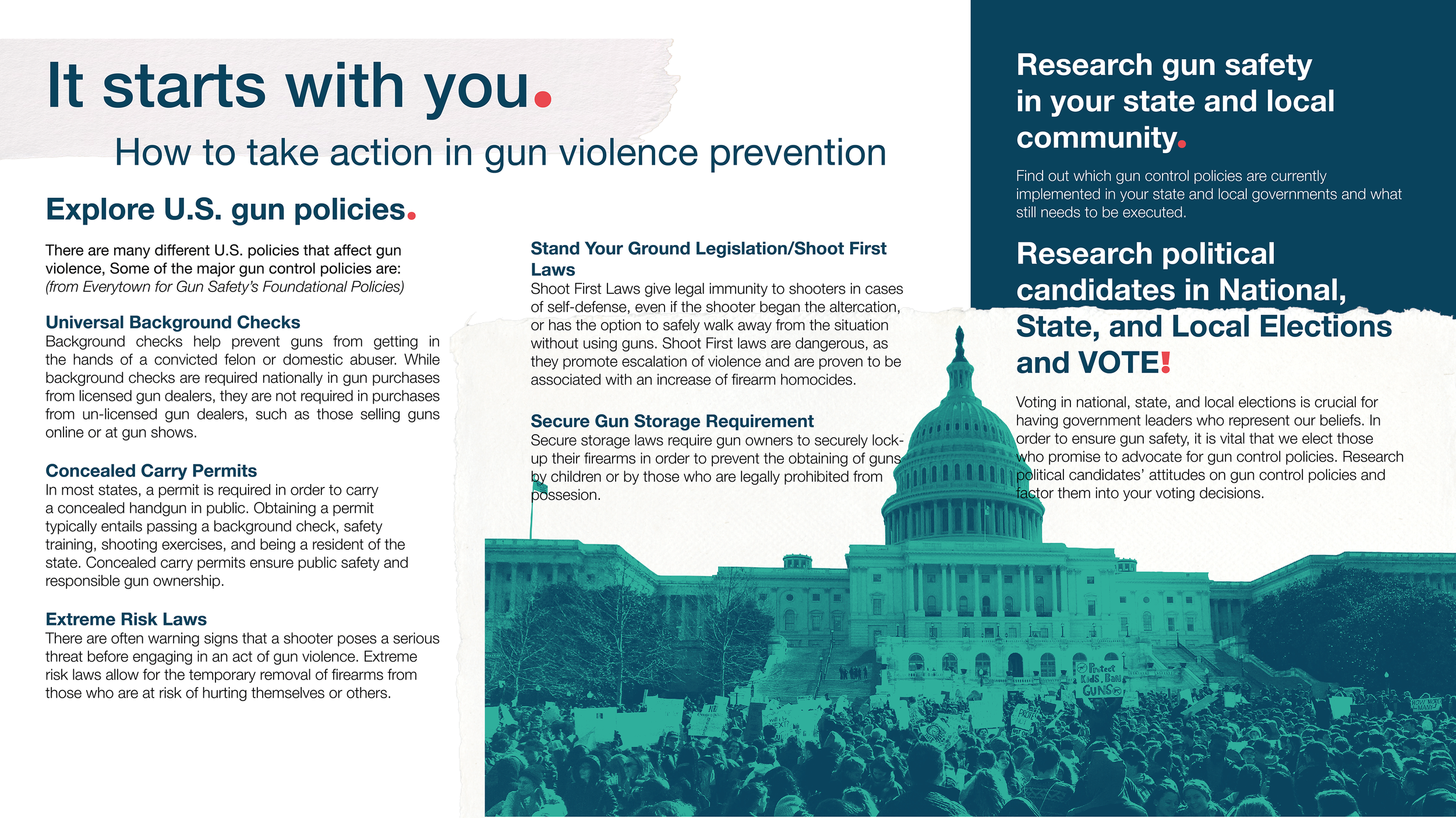
Brochure

Flier
Social Mockups