Paint the Masters
Paint the Masters showcases a precise recreation of an iconic piece of graphic design, demonstrating meticulous attention to detail and a deep understanding of design principles. This project highlights the technical skills required to analyze and replicate a professional composition.
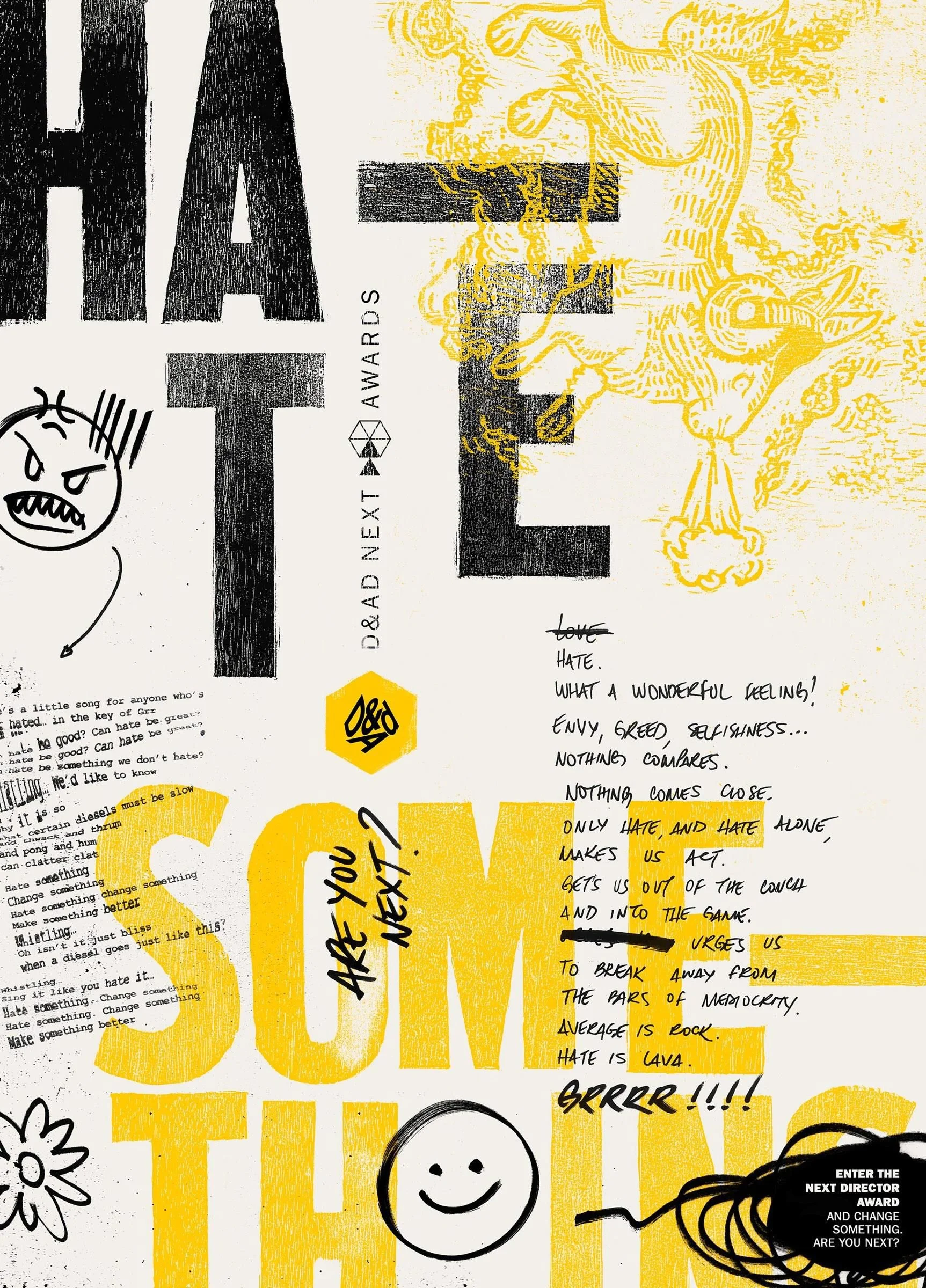
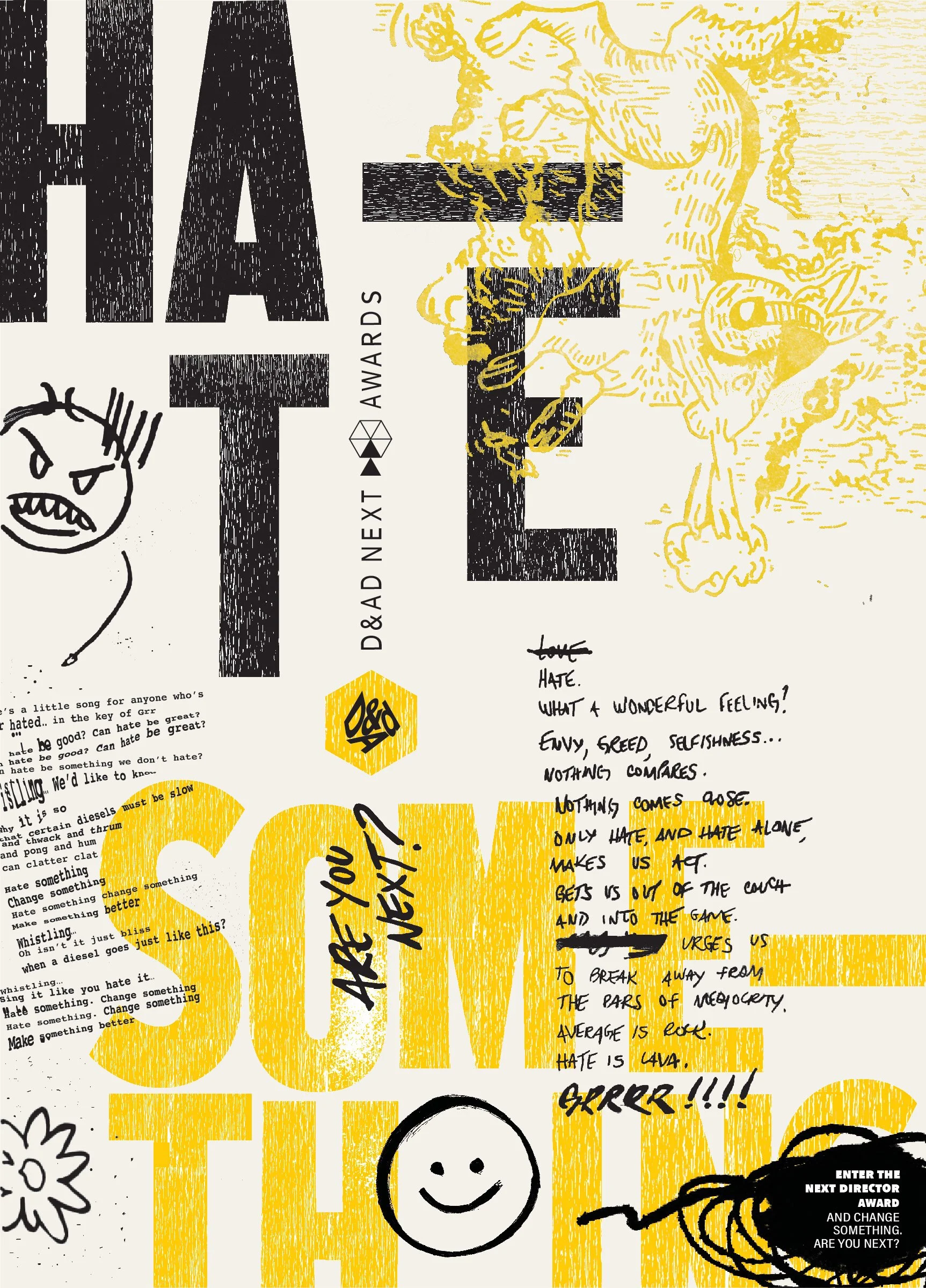
Original Masterpiece: F/Nazca Saatchi & Saatchi: D&AD Creative CampaignPaint the Master/ReplicationFor the Paint the Masters assignment, I recreated a chosen poster composition from scratch. Drawn to it's chaotic, rebellious, and unapologetically expressive aesthetic, I chose to replicate this poster from F/Nazca Saatchi & Saatchi's campaign for the 2016 D&AD Awards. To ensure accuracy, I sourced the exact font in Adobe Illustrator for key text elements, including the "Hate Something" phrase, the poem on the left side, the “D&AD” logo, and the bottom-right text. I hand-drew and wrote all handwritten and sketched elements—such as the Grrrr poem, doodles, "Are you next?" text, bottom-right scribbles, and bull illustration—before refining them in Photoshop. The most challenging aspect was replicating the woodcut texture, which I achieved by layering multiple woodcut patterns over the original texture elements to closely match the authentic effect.
Mockingbird
The Mockingbird assignment was to create our own poster using the same style as the Paint the Masters poster selection, advocating for a change we would like to see on campus. We were tasked to change the words, colors, and visual content of the poster, while keeping the general composition, graphic elements, typography, and look and feel of the poster the same.
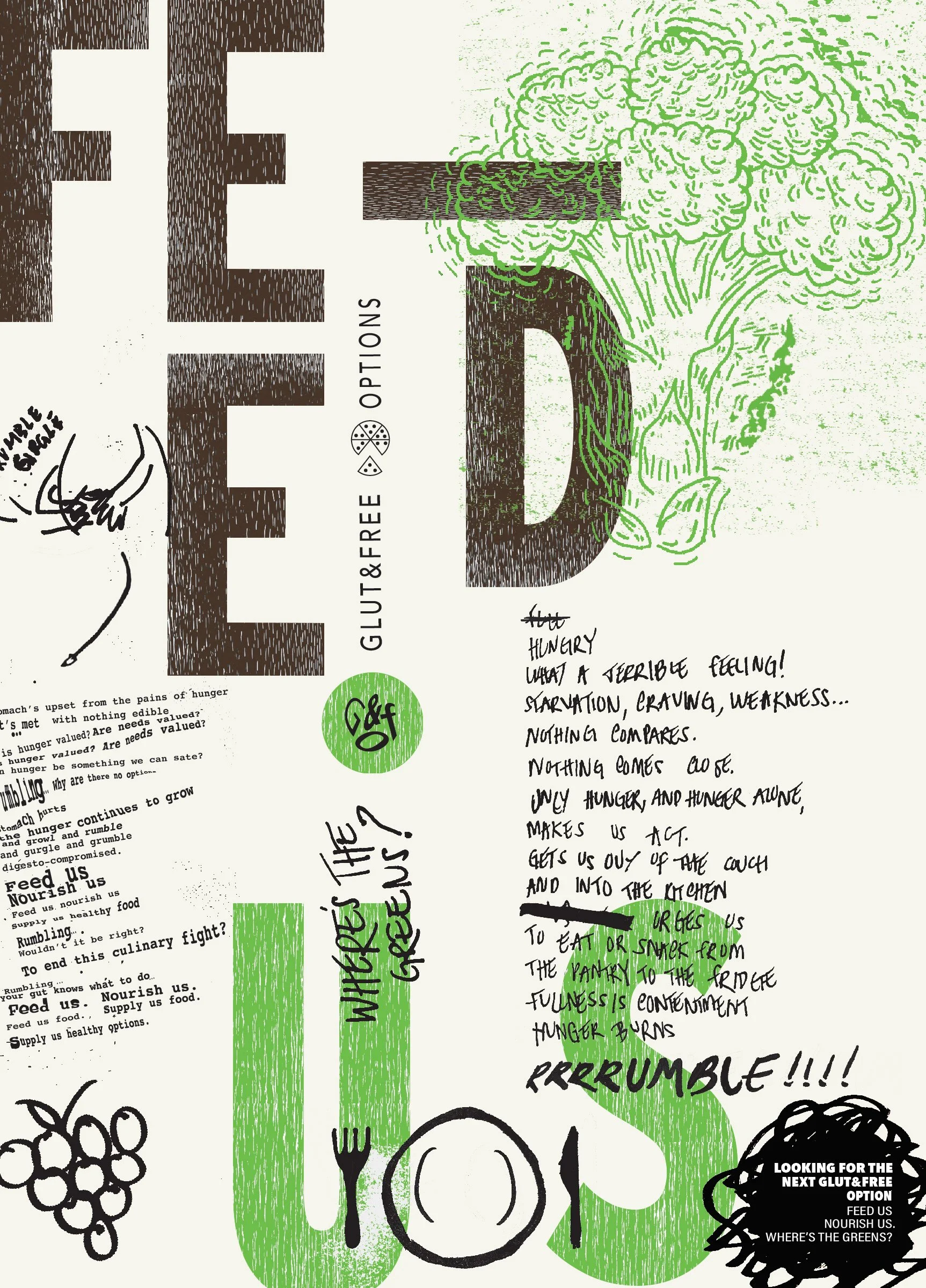
For this project, I reimagined a classic poster design to advocate for increased gluten-free food options on campus, maintaining the original composition’s style while adapting its message. I replaced the headline “HATE SOMETHING” with “FEED US” to command attention in a similar way. Retaining the original font and woodcut texture, I shifted the color palette to dark brown and bright green, reflecting natural, plant-based foods while preserving the bold visual impact.
Key graphic elements were adapted to fit the theme, such as replacing the original bull illustration with a broccoli drawing in the same woodblock style. I maintained the hand-lettering style and structure of the original poems but rewrote them to focus on hunger rather than hatred, including changing “GRRR” to “RRRRUMBLE” to evoke the sound of an empty stomach. The repetitive phrase “hate something, change something” was transformed into “feed us, nourish us.”
Additional modifications included replacing the original doodles with food-related imagery, such as an empty plate and a hungry stomach, and swapping the “D&AD NEXT AWARDS” text for “GLUT&FREE OPTIONS” as a play on words. The hexagonal logo was redesigned into a circular shape, resembling a pizza or pie, reinforcing the food theme. Through these changes, the poster retains the essence of the original masterpiece while delivering a new, impactful message.
This assignment taught me how to analyze and adapt a design while maintaining its original style and impact. It strengthened my skills in typography, texture replication, and conceptual messaging, showing me how visual elements can be reinterpreted to communicate a new idea effectively.